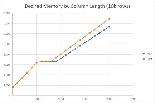
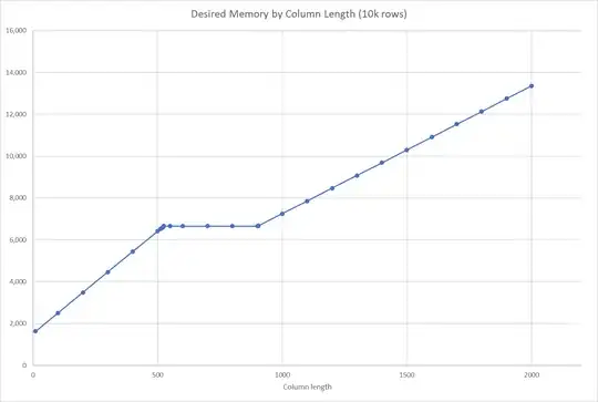
The graph for this other question is for a 1 million row table. When drawn for 10,000 rows the graph has a rather different and more interesting shape.
There's a plateau when the column length is between 524 and 903 long.
This shape is seen on my work and home laptops. (SQL Server 2017 CU27 and 2017 CU22, 2019 CU8 respectively. Both boxes have 16GB RAM.)
The slopes vary slightly between versions.

This makes me think its a genuine design choice that's been tweaked rather than an artefact.
Setting BATCH_MODE_ON_ROWSTORE = OFF for SQL Server 2019 makes barely any difference. Desired memory is the same at all sizes except t800 which is 6688kB OFF and 6656kB ON.
How come this graph has this shape? What considerations mean a three-region solution is optimal at moderate row counts (10,000 rows) but not at larger row counts (1 million rows)?
I understand no one outside the SQL Sever development team will be able to conclusively state the reason this particular graph is this shape. But generally speaking, from academic and industry experience, if I were to start writing a memory management module for a hypothetical DBMS, what sort of considerations would lead to this sort of outcome?
