A website I'm creating is going to have three breakpoints: desktop, tablet landscape, mobile. Should I write a test for each resolution?
2 Answers
It is unlikely that you catch layout-related regressions with Selenium tests:
The regressions related to how elements are displayed lead to layouts which look broken, but still have all the elements needed to perform the test. If you ask Selenium to enter text in a field, click on a button and wait for specific text to appear in a specific
<div>, Selenium won't be able to know that the button is too short for its contents or that the text input has a wrong position on the page, or that the text within the<div>fills two lines instead of one.The regressions which move the elements out of the drawing area (which leads to test failures, if, for instance, Selenium is asked to click on a button which is not visible) are too random anyway and usually lead to flaky tests.
You can, however, use pdiff tests to detect changes in layout: the goal of those tests is specifically to catch visual regressions. If you target three screen sizes, it is indeed a good idea to run the tests for all three sizes. It is not unusual to use four or five sizes, and is especially valuable given that developers rarely check how their changes influence the layout for very small or very large screens.
- 137,583
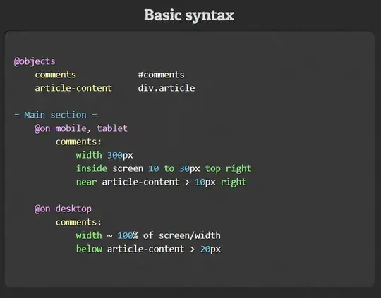
Use a design spec test to validate computed CSS properties for each breakpoint. For example:
At the top of the spec file, we define named elements using CSS selectors. These can then be used throughout to refer to elements by name.
We then group element checks by viewport size so that we can make different checks at different responsive breakpoints. Named viewport sizes like small, medium and large are entirely customisable. The exact viewport dimensions are specified in a global test suite file that isn’t shown here. The
*group runs checks for all viewport sizes.Within each viewport group, we then provide the name of the element we want to check. Within each of these are the actual checks we want to carry out. Checks tend to focus on dimensions or relative position to other elements in a component. It is also possible to directly check final computed CSS properties, like text color or font size.
References
- 382
